When Microsoft introduced Office 2007, users suddenly faced a new kind of user interface – the toolbars and menus known from the previous versions of Office (in fact: all previous versions of Windows!) had vanished and had been replaced by the Ribbon.
The Ribbon is a huge change – not only for the end user but also for the developers writing Windows applications. Microsoft characterizes the Ribbon as
“the modern way to help users find, understand, and use commands efficiently and directly – with a minimum number of clicks, with less need to resort to trial-and-error, and without having to refer to Help.”
Microsoft User Experience Interaction Guidelines
for Windows 7 and Windows Vista
From what I know today, this is quite a statement… not because it is wrong but it is quite a challenge and many people did not like to take on that challenge and really embrace the Ribbon concept.
Working for a software development company, and providing a product that has switched from classic menus and toolbars to a Ribbon interface, I know what I am talking about.
Resources
It is still difficult and confusing to gather good resources about the Ribbon, the ideas behind it and the design principles that lay the foundation for the development of your own application. But here are some good starting points that I really found helpful:
- To understand the ideas behind the Ribbon and the reasons that made that concept necessary, have a look at The Story of the Ribbon.
- The Microsoft Windows User Experience Interaction Guidelines documentation (aka “UX Guide”) if you want to know what Microsoft thinks on how Ribbons should be implemented into applications.
Developers obviously want to know where they can get a Ribbon Control to use but that is a different topic.
The Ribbon is a Change – and constantly changing
That – to me – is currently the greatest challenge: the Ribbon is not only a change from the previous concept, it is constantly changing itself! While that change is positive because it incorporates lessons learned from previous implementations, it is also challenging because just the minute you thought you had your thoughts and ideas together, you are faced with a new twist in the whole ribbon story!
If you now combine that with the task to develop some software application exposing a Ribbon interface, you suddenly find yourself back to the drawing board just the moment you thought you had your design!
When Microsoft Office 2007 was released, the Ribbon in Microsoft Word 2007 showed the following Home Tab:
 One version later, Microsoft Word 2010 showed the same Ribbon but the design had changed – and not only visually, as we will see later:
 Click the images to see the original size – it makes the view a bit clearer.While the visual design is one thing (and as any question of taste it is not really worth arguing about it) the change in the so called Application Menu makes things different for developers.
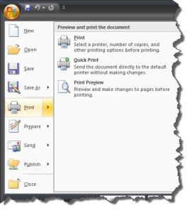 In Microsoft Word 2007, the Application Menu was available via the Application Button (that Bubble in the upper left corner of the Ribbon) and was merely a big drop-down menu named the Application Menu.
If the user clicked one menu item, they either executed an option directly or where directed to another dialog (e.g for the Save and Print commands).
In Microsoft Word 2010, we are seeing the evolution of the original Ribbon featuring an Application Menu into a new version of the Fluent User Interface now featuring an area called Backstage, available via the File Tab. There is an in-depth article about this feature available here.
What does that mean to the end user and the developer? First of all, the end user has to adjust what they just learned about the new user interface. If they loved it before, they may love that change – if they hated it before, they will take it as a sign of instability and hate it even more. For the developer, it opens up space – literally: the Backstage area allows for a much better organization of information and eliminates the need for that additional dialog that we still had on Microsoft Word 2007 when we clicked Print on the Application Menu.
 Nonetheless – a change is a change and if you just line out your application design you may find it quite annoying that you now have to adapt it, especially if you want your applications merge into the new Windows User Experience as seamlessly as possible.
The Components of the Ribbon
Besides the Application Menu vs. Backstage question, the components of the Ribbon are pretty much the same in Microsoft Office 2007 and Microsoft Office 2010. They may look slightly different but their intentions and functionalities are the same.
 Click the above image for a larger view – it outlines the major components available in a Ribbon (but not the actual controls which we will do later).
The Ribbon Tabs
The typical Ribbon consists of a set of Ribbon Tabs (or Tabs) which are identified by the Tab Header. The Ribbon Interface knows three kinds of Tabs – Core Tabs, Contextual Tabs and Modal Tabs.
Core Tabs & Standard Ribbon Tabs
Core Tabs are always visible. Microsoft has defined a set of Standard Ribbon Tabs that should be available in any application as long as the features they are exposing are relevant to the application. These Standard Tabs – defined in the UX Guide, Page 274 – are Home, Insert, Page Layout, Review, View and Developer.
Thinking about it, it makes a lot of sense to have the same Tab with the same functionality in different applications – why would you call a Tab Insert in one application and Add in another application if they both offer functionality to place elements into whatever your application is dealing with.
And it also makes sense to not always have all Standard Tabs in your application: if there is nothing to insert in your application, why would you have such a Tab in the first place?
Contextual Tabs
Unlike the Core Tabs, the Contextual Tabs are not always present – they expose functionality only applicable if your application is in a specific state – in Word, for example, the tabs dealing with table-related formatting are only visible if you have a table selected.
Contextual Tabs can be shown or hidden by the developer – it is their responsibility to wisely use them! Again, Microsoft has defined a set of standard Contextual Tabs one should use if they make sense in the own application: Format, Design, and Layout.
Modal Tabs
Modal Tabs are used to replace the Core Tab Set (and also any available Contextual Tabs) by a single Tab when your application comes into a specific temporary state where only specific actions are available. Modal Tabs are pretty rare – in MS Word 2007, I am aware of the Print Preview being presented on a Modal Tab but in MS Word 2010, that is no longer the case. As an example, I can present MS Wordpad (in Windows 7 available with a Ribbon Interface and having a Modal Tab).
 My personal feeling is that a Modal Tab should be avoided if possible – it disrupts the flow of the user and forces them into a specific pattern of doing their work. However, there are still cases where a Modal Tab may offer value to both, the developer and the end user.
The Ribbon Groups
Each Ribbon tab organizes its commands into Ribbon Groups. A Ribbon Group clusters commands of a related area into one place – e.g. the Clipboard Group, Font Group and Paragraph Group on the Home Tab.
 Again, Microsoft has lined out a set of Standard Ribbon Groups for the previously discusses Standard Ribbon Tabs (see UX Guide, Page 275) and some really meaningful tips on how to organize groups and tabs appropriately.
The Quick Access Toolbar
One of the things that you will hear frequently from your users is “Why did you put X onto tab Y? I need it much more frequently together when on tab Z!”. Well, you cannot really predict every single users way of working with your application – and for those that need frequently used commands at hand without having to switch tabs, the Quick Access Toolbar comes in really handy!
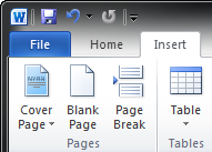 The Quick Access Toolbar – or QAT – lives in the upper left area of the Ribbon – in MS Word, it contains some default commands such as Save, Undo and Repeat.
The idea is that the user does not have to know where exactly those commands are hidden on different Tabs or the Backstage area – if they are frequently used, place them in the Quick Access Toolbar. But a good application design should foresee a possibility for the end user to add their own choice of commands to the QAT.
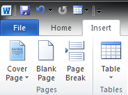 What if someone is frequently working with tables and needs to insert quick a few of them on a regular basis? Well, just add Insert Table to the QAT!
The picture to the right shows a customized Quick Access Toolbar, having the icon for Insert Table added next to the Repeat command.
As a developer, you want to make sure, however, that the user’s Quick Access Toolbar is persisted when the application is closed – there is little use of a QAT you have to redefine every time you are starting the application!
Enhanced Tooltips
Tooltips are great – they have always offered a way to present additional help to the end user without having to use a huge label on a control or refer them to the help file. However, they had been confined to a rather small space. With the Ribbon, Enhanced Tooltips became the standard.
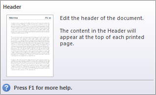 In the old days, the command Insert Header might have had a tooltip similar to this: “Adds a header to each page of your document.”
While this may have been the correct information, the Enhanced Tooltip simply adds to the user experience! It does not contain any more information than the simple tooltip above – but the layout with a thumbnail preview, a title and the additional footer telling you that there is more help available if you press F1 makes the whole thing much more appealing to the regular end user.
Ribbon Galleries
Speaking of eye candy: another neat feature of the Ribbon is the support for Galleries. Remember the old days of Microsoft Word when you had to select a paragraph formatting from a drop-down box giving you the name of the actual paragraph formatting but no information as to its appearance?
The Gallery is the perfect tool to enhance that user experience: it allows you to provide a visual representation of the actual choice, clearly showing the end user what they will be getting when they choose this option.
 Galleries obviously only make sense when there is a set of clearly defined, related and visually representable choices. But if this is given, then a Gallery is a great tool to use. The Ribbon acactually supports two types of Galleries – the in-Ribbon Gallery which we see an example of above and the drop-down Gallery which for example is used in Microsoft Word 2010 to select a Word Art for insertion.
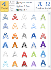 Drop-down Galleries make a lot of sense in several scenarios:
If the space used by the Gallery is too big to be displayed in the Ribbon.
Or if some (or all) choices the Gallery has to offer are used to infrequently to justify their presence in the always visible section of the Ribbon.
Frequently, Galleries are a combination: even the Style Gallery offers a drop-down for the additional, lesser used styles defined in the document!
Embracing the Ribbon
Here is my personal point of view and I am sure that many of you will object for reasons as good or as bad as my own ones: I think the Ribbon is one of the great enhancements to end user experience we have seen in recent years – I like it, I find it friendly to work with and I think it makes my life easier than an armada of toolbars I need to switch on or off and get lost with.
But the ribbon is also a challenge. The end user, who may be used to menus and toolbars, may be reluctant to accept that change – so if you are thinking of moving an existing application from a menu/toolbar oriented design to a ribbon oriented design, be prepared for some heavy flak.
A Word of Warning
Not only the end user is challenged: the developers and user interface designers are as well: a Ribbon is a complex sciences of its own – and simply converting menus and toolbars into ribbon commands is not a winning step!
Unfortunately, there are enough examples where applications introduced a ribbon interface without having understood the concept behind – and that almost guarantees a bad user experience which in return results in end user rejection of an otherwise great concept.
I am not gonna excuse myself – I have written what I have written here because I have been there, trying to understand the Ribbon concept and bringing it into an application with little to no experience. You can call that learning the hard way. But it should not be an excuse to not learn at all!
And for all of those who are going down the same road: please keep in mind that you will only be able to implement a good design if you are willing to let go of the existing: if you move your application to a ribbon, you need to think out-of-the-box because nothing will simply translate. And don’t forget all that additional work that you may not even have the expertise to perform yourself: user interface design, icon design, process flow analysis, usage statistics, etc. – all those things that may add relevant information to your ribbon design process but cost time & resources that you may not have accounted for.
But do not let that discourage yourself – the experience is well worth making but maybe you do not want to chose your flagship product to give it a first shot 😉
