One thing needs to be said first: I am neither a Photoshop /Lightroom Expert nor do I want to pretend to be one – so this post is more about my learning experience than a guide on how to develop RAW Images for the perfect result.
On the other hand, I thought it might be worth talking a little bit about experience exploring the topic because I do believe that everyone might be able to add at least a certain amount of development to their photos, even if one is not able to apply the perfect development – and in the end, it is about taste: your images are your images, so it is you who is deciding on how far you want to take them… so here is my example:
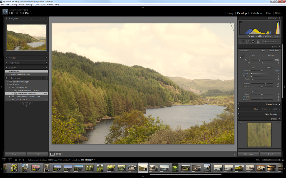 This photo has been taken in Scotland on a rather gray and overcast day – it was a quick shot from the roadside, even with a light drizzle of rain.
The Histogram
 The Histogram is a graphical representation of distribution of data. It is a frequently used tool in the world of statistics, not in any way bound to the work done with digital images. With digital photography, the histogram is used to visualize the presence of brightness in the image.
The far left side of the image represents the dark side of the spectrum, the right side represents the bright side – if you are working with a black and white image, the left side represents Black, the right side represents White.
In a color image, at least in the RGB World, the Histogram shows the presence of information in any of the three color channels, Red, Green and Blue. Where information is present in more than one channel, the colors mix – e.g. if information is available on Green and Red Channels, the Lightroom Histogram shows Yellow. Where information is present in all three channels, the Histogram shows gray.
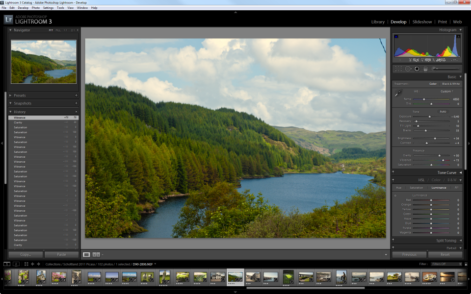
So far, so good – but what does it tell you? The Histogram of the image above shows two things: there is very little information on the left side and a rather big peak of data present on the bright side of things. The result is an image that lacks clarity – it is dull, contrast is low.
Adobe Lightroom 3 is doing quite a good job in helping you understand the Histogram and the impact of any change you are making to the image (as much as it reflects the Histogram).
As a first step, I am trying to adjust my image and make sure that the image is using the full available width of brightness – let’s focus on the bright tones first.
If you move the mouse cursor over the little arrow in the upper right corner of the Histogram, you can see the areas in the image that are cut off at the moment – Lightroom colors these areas in red – if you click the arrow, the display is persisted in the image window, if you click the arrow again, it switches back to the mouse-over mode.
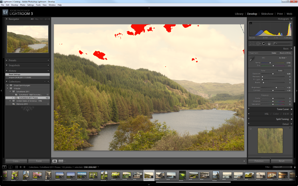 As you can see in the above screenshot, there is quite a bit of information lost on the bright side of things – anything that is visualized red is displayed in pure white, regardless of the small distinctions in color that have been recorded by the camera’s sensor.
There are several ways to eliminate that loss of information and return the color in the now “lost” areas: I am going to use the Recovery slider to adjust this area of the Histogram – you could as well move the area in the Histogram directly.
By moving the slider, I am little by little eliminating the clipping (visually indicated by the disappearance of the red clipping areas in the image). With Recovery at about 25, I have moved the spike from the edge of the Histogram ever so slightly towards the middle, with a tiny gap on the right edge – now all the information recorded by the sensor (on the bright tones) is within the image and nuances of white replace the formerly plain areas. That takes care of the white and light gray tones.
At the far right of the spectrum, the situation is quite the opposite: there is no information recorded for the dark areas – the result are washed out colors in the image. Now, we can take advantage of this situation and stretch the available information into the dark area until we reach a clipping (equals loss of data) which we are trying to avoid.
The small arrow in the upper left corner activates the display of clipping information for the dark channels – the color used to indicate loss of data here is blue. The more I move the slider for the Blacks, increasing its value, the more the data is shifted to the edge of the Histogram, resulting in the first blue pixels around a value of 25 which tells me to stop here because any further increase here would clip the dark tones.
The interesting thing with adjusting the Histogram is that all four sliders influence each other – it takes a little bit of playing to get a feeling for the Histogram – you can, of course, use Lightroom’s automatic adjustment by clicking the Auto button above the Exposure slider but all that does is trying to automatically figure out the best setting – with can but does not have to work.
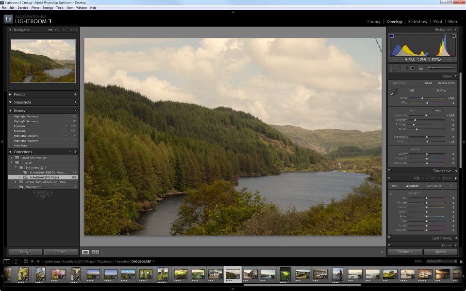 Now, with very little effort, I have worked out significantly more details on the sky and the clouds than the original display of the image showed. The important thing to remember is that all this information has been recoded in the RAW Image and had just not been visualized – if I had set the camera to store the image as JPG, the information would have been lost.
Further improving the Image – White Balance
I am still not happy with the image – because of the weather that day, it still looks somewhat gray and darkish – and to me – slightly yellowish, although we now have spots of blue sky in it.
One of the important aspects of the RAW Image Development is finding the proper White Balance. To put it in simple words (you Pro’s, please excuse the over-simplification): the White Balance is what makes the White in your image appear white.
Unfortunately, the situation under which an image is taken (sunshine, clouds, flash or no flash, indoor, under-water, etc.) has a huge impact on the representation of colors. Unfortunately, your Monitor has as well!
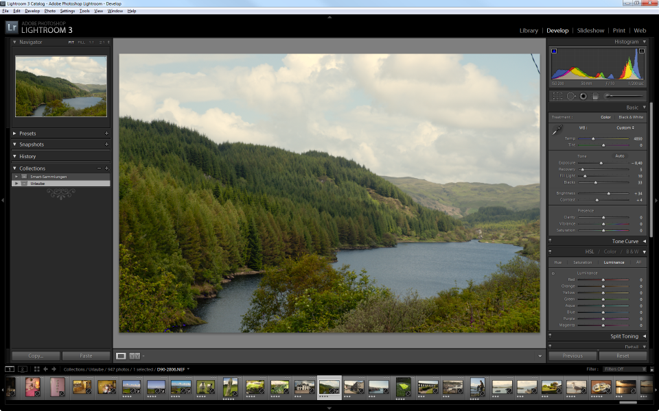
So by setting the White Balance on an image, you are specifying under which light conditions the image was taken. Because Lightroom will try to compensate for the (specified) environment, the effect will be the opposite: specifying a very warm color condition (say 4500K), the image will shift to the cooler side of things to compensate. Specifying a very cold color (say 6000K) the colors will shift into the warmer section.
The image strip below shows the impact of White Balance on the sample image: only by setting a different Color Temperature, the colors shift from cold to warm.
 Again, I feel that White Balance is a matter of personal taste – I myself prefer the slightly cold tone on my images, others don’t.
While the Temp slider is adjusting the Color Temperature along an axis from Blue to Yellow, the Tint slider is shifting the colors along an axis from Green to Magenta. Best thing is to explore the impact of moving the sliders in either direction – as I said: to me, the best setting is a matter of taste.
 If it is true that White Balance is a matter of personal taste, the next section is even more so.
Clarity, Vibrance, and Saturation
Let’s talk about Clarity first. The Clarity slider can take values from -100 to 100 – I will quickly show you the impact of the settings on the sample image, using both extremes and Zero.
 You can use Clarity to add contrast to the medium tones in the image – that are the parts that fall into the mid of the Histogram. And that explains why the impact on the sample image is sort of low: there are not too many areas falling into the mid-tones here. So Clarity has different effects on different images, depending on the distribution of tones within the image.
Next is Vibrance. Like Clarity, Vibrance can take any value between -100 and +100. To demonstrate the effect, I have compiled another sample strip, this time showing the effect from 0 to 100 with 50 as a mid-value keystone.
 In this case I skipped the -100 extreme to demonstrate the positive range of values. Vibrance increases (or decreases if you go into the negatives) the intensity of dull colors while it leaves the saturated tones alone. And that is the big difference to the final slider, Saturation.
Saturation works on all colors in the image and intensifies them – the dull ones but also the ones that already have a high degree of saturation.
 In other words: you can use Saturation to increase the brilliance of dull colors but it will (most likely) over-intensify the already saturated areas of the image, providing for overly gleaming colors.
From the results I have seen, it seems that Vibrance is the better choice to increase the brilliance of colors – but Saturation can be used to reduce the overall brilliance of a very intense image.
 There are more possibilities – in fact, I just scratched the surface of image development. One thing, however, if quite obvious: many of these possibilities only expose their full power if you are working with RAW Files.
And then it is all about taste. As I said before: your images are your images. You need to like them and if you manipulate them, there is always a certain level of interpretation and art in them. You may find people saying that this is not the original image any longer and that is true – it is your interpretation of what the image should look like. Taking the shot no longer is the final step – it is only the first one.
 The image above shows the Before and After comparison built into Lightroom.it is quite a cool feature and quickly demonstrates the impact of the development process compared to the original image.
And the other cool thing: if you don’t like the result (or want to try different settings the next time): Lightroom does not in any way manipulate the original image so you can always come back. The changes (the development) are purely stored in Lightroom’s database and are applied when rendering the image (or exporting it).
But that, of course, also means that you need to take good care of your Lightroom database and regularly provide for backups! But that is a different (but very important!) story…
