Yesterday, I wrote a bit about visualization of geospatial data – at the end of the day, I was able to present an early state of data visualization using the Google Maps API.
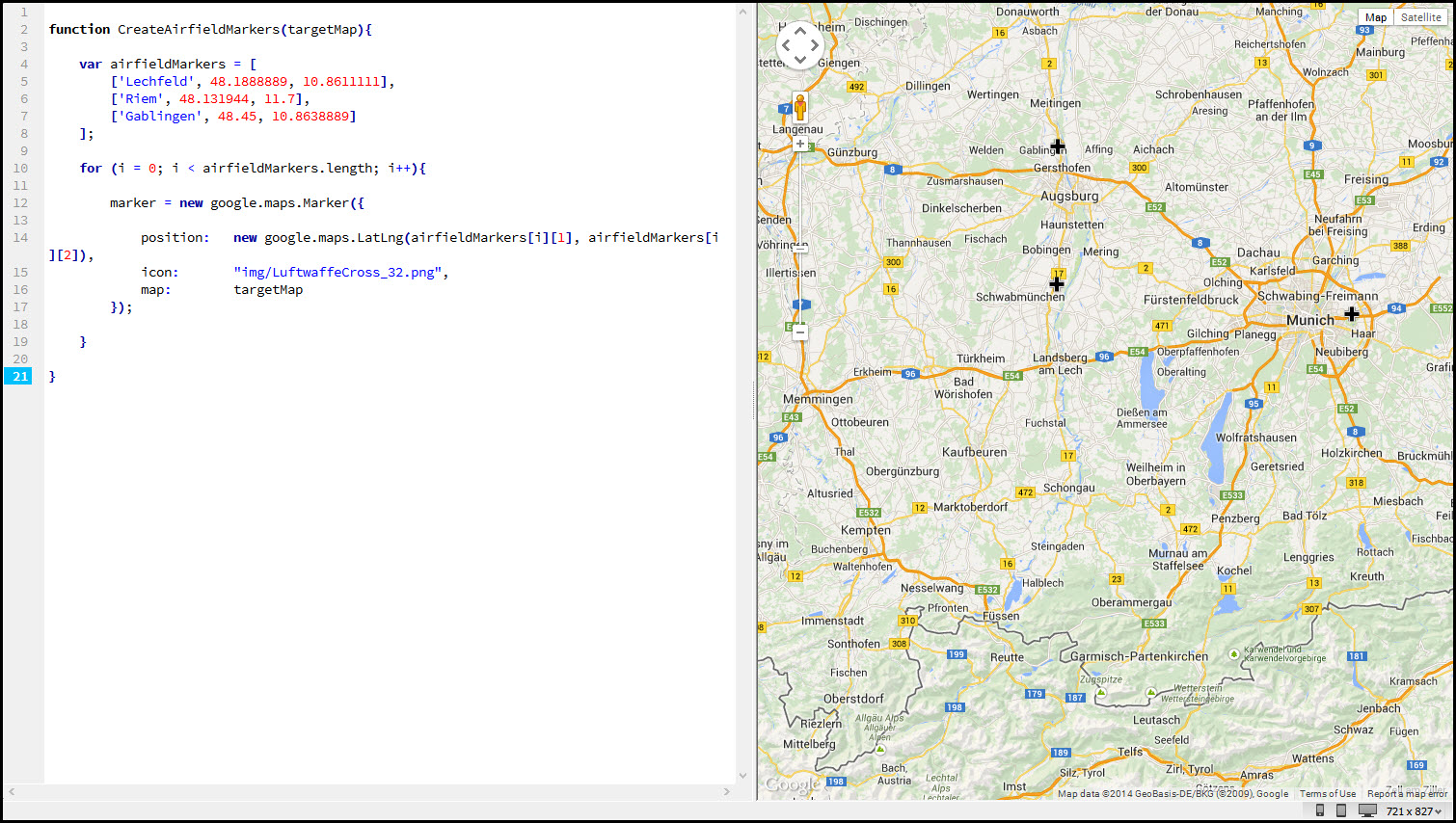
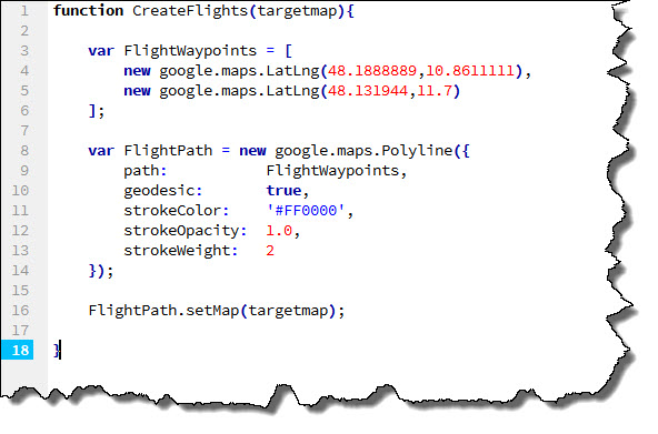
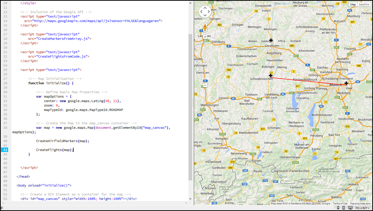
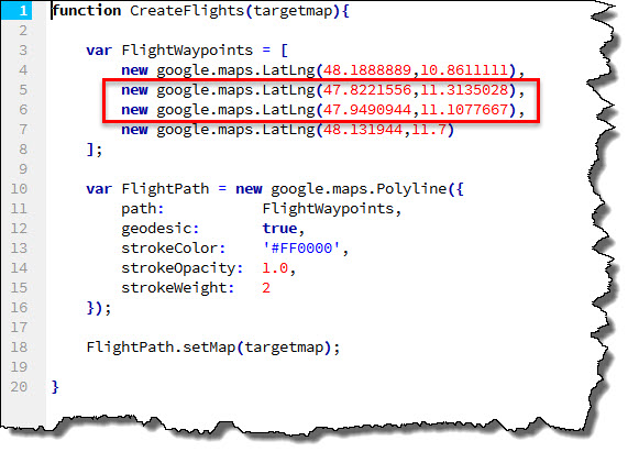
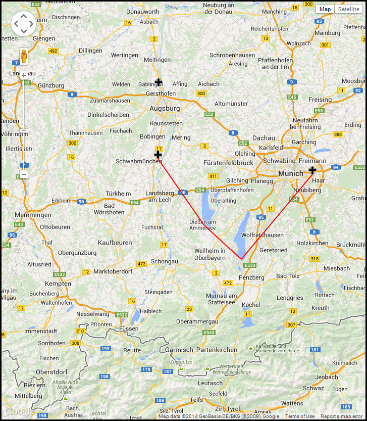 The visualization included custom markers on former Luftwaffe airfields in southern Germany, and a flight path from the airfield in Munich (Riem) to the airfield of Lechfeld. When I left, there had been a couple of open items I wanted to further work on.
The curse of Flying but not Leaving
My first problem was that the Luftwaffe Flight Log I was using as an example (which can be found here) consisted of typical “training flights” at first – which means that the pilot – Walter Stolz – has departed and arrived from the same airfield, sometimes multiple times a day.
Visualizing a flight where a pilot is taking off and landing on the same airfield and without any additional information about the route taken is difficult and can only be a symbolic action. So I decided to fall back on a simple circle. Take the very first flight in the flight log (translated into plain language):
“On June 5, 1940, Walter Stolz was departing (as pilot-non-flying) the airfield of Munich-Riem in a Junkers Ju 86 E-5 at 13:12 hours. The aircraft has the registration number [VB+PF], the flight is taking 126 minutesand the cover 546 kilometer, landing at Munich-Riem at 15:18 hours.”
That is a lot of information but not enough to determine their course – and more information is not available.
Let’s consider this: the crew of [VB+PF] has been flying for 126 minutes and they covered 546 kilometers – if we ignore any head or tailwinds, etc., their flight would have taken them at a maximum anywhere within a radius of roughly 275 Kilometers.
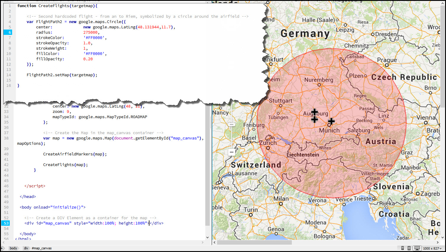 The insert at the top left shows the new code of the function CreateFlights – this time, I am using a circle with a diameter of 275.000 m (our 275 km) with a red outline and a mostly transparent red color. We don’t know where – but we know that somewhere within this red circle, the crew of [VB+PF] has been…
Looking at all Flights
As mentioned before, we are not looking at a single flight – we are looking of a series of flights by one airman. And that airman had a second flight on June 5th, 1940 – this time leaving at 15:21 and returning to Munich-Riem at 16:00. A sweet 39-minute flight, covering 170 kilometers…
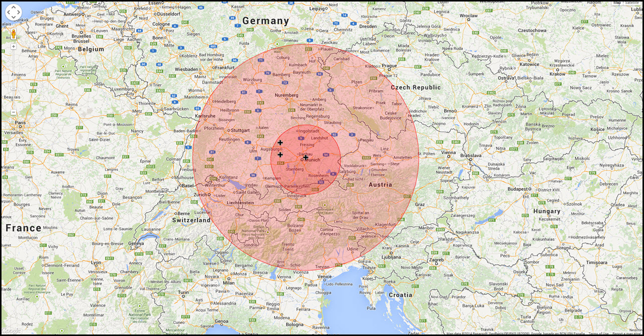 Let’s add some more flights – Walter Stolz has entries for June 19 and June 20, 1940 from Munich-Riem, then on June 24, 1940, from the airfield of Gablingen and then more flights from Munich-Riem. I have visualized only the first five.
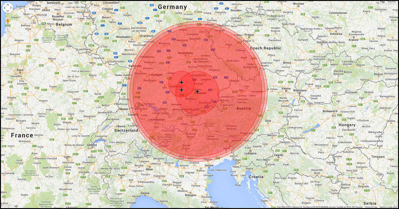 It’s getting a bit crowded now. There’s only five flights on the screen now but we already have two issues:
- we do not know the sequence of these flights and
- we will not be able to see much more if we keep adding flights.
First things first – making Data… Data!
Before I start fiddling with time (sounds cool, eh?) I need to fiddle with my data. So far, the function CreateFlights was used to more or less directly create the Google Maps Elements that represented the flights. In other words: it did not provide data, it provided the final elements to display. Now, this is gonna change:
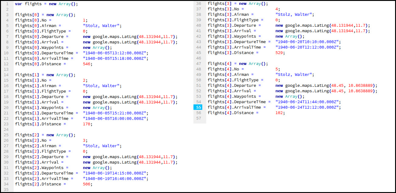 As you can see, I am now building an array named flights. Each element of the array is created “manually”, that is by coding it and each element contains several pieces of information:
- The Number (“No”) indicating the flight number in the airman’s flight log.
- The name of the Airman.
- The FlightType. Currently, they are all 0 but I will have some 1 eventually – 0 is a local flight (departing and landing at the same airport) and 1 is a ferry flight from one airport to another one.
- The Departure and Arrival positions, already expressed in Google Maps API LatLng.
- The Waypoints which are currently an empty array all across.
- The DepartureTime and ArrivalTime.
- The Distance the flight covered (which I need to determine the different diameter of the circles when the flight is a local flight (FlightType = 0).
The chance within the CreateFlightsFromCode.js file now also means I need a routine in my code to interpret the data and act upon it.
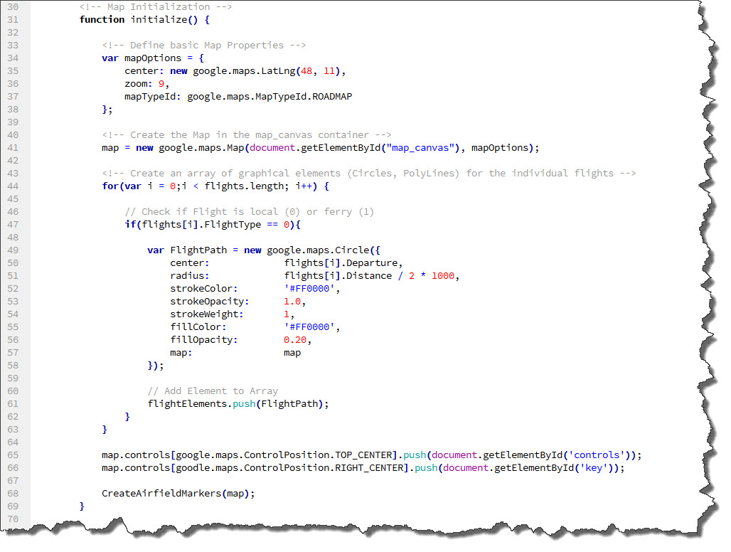 As you can see, I am now looping the array flights and act upon each individual item. Currently, the implementation is incomplete as the else part of the if…else… statement (dealing with the FlightType = 1 items) has not been implemented. But for now, this is fine as we only got flights which depart and arrive at the same airfield.
Where is the advantage? Well – it lies in the fact that I no longer have to worry about what to do with a certain flight and how to handle it. I can now push all that logic to the managing portion of the code and focus on the provisioning of more data.
Also, the managing code will remain unchanged if I change the way of provisioning the data – as long as I provide a filled flights array, it does not matter if I manually create the code to fill it or if I change that code to retrieve the data from elsewhere, a database for example.
Now, my Data contained within the CreateFlightsFromCode.js file is…purely data! And by the way: I already sneaked the 4th dimension in: there now is a temporal component in the data – the flight’s departure and arrival times. And by the way: running the new code on the new data produces exactly the same output with the five circles as before…
Exploiting the Temporal Component
Let’s see how we can exploit the temporal component. The ideas I am going to implement here have been strongly sparked by the tutorial video I referred to in the first post on this topic, particularly the two ones by Paul Saxman and Brendan Kenny. So this is the place to give a big “Thank you, guys!” to the two – they helped me a lot to understand the basics of what they were talking about and get these ideas transferred here. Any in case, anyone is wondering about their source code – a version is available (pretty much hidden) here.
Back to the temporal component: Paul and Brendan took a quite interesting way of dealing with time… by eliminating it. In their samples, they made sure that the data they worked with was already sorted by time (in their case the time of the earliest geoposition for each voyage) which put them into a position to know that an entry in their array (which for me is the flights array) is later the larger the index if the entry. That allowed them to fade in their data one after the other by merely applying the visibility-flag to elements in a particular way. Very clever!
Looking at my data, this is true as well – the five flights we have so far are in perfect chronological order… so we can do the same thing Paul and Brendan did. Here is a first stage of the changes – those to the already existing code:
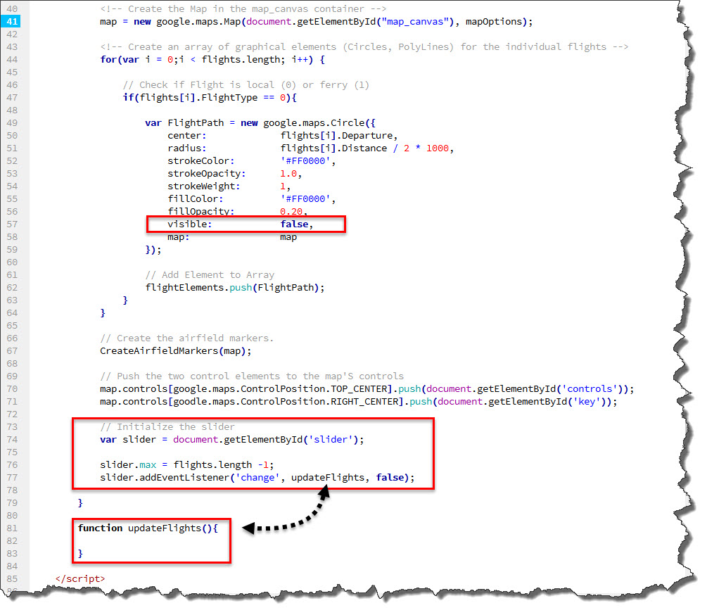 First of all, we keep creating the Google Maps Elements but they are now created invisible – the visible attribute takes care of that. Next, the slider is initialized – first down in the actual <body> element itself
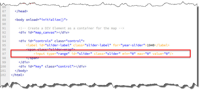 and then in the Java Script function – see the second red box in the image before the last. The slider receives an EventListener that is fired on the “change” event – in other words: every time the slider is moved. The listener needs a call-back function to execute when fired – that is, in my example, called updateFlights.
As a result, every time the slider is moved, the code in updateFlights is executed – which now needs a proper implementation.
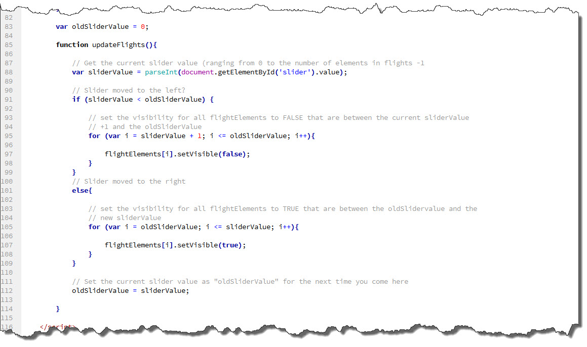 The implementation pretty much follows what Paul and Brendan did:
- it initializes a “memory” for the previous slider value and sets it to 0 (a global variable!)
- it reads the current value of the slider into the variable sliderValue.
- it checks if the current value is lesser or greater than the memorized value – if it is lesser, the slider was moved to the left (into the past), otherwise, it was moved to the right (into the future).
- Depending which direction the slider was moved, make elements invisible (to the left) or visible (to the right).
- Finally, memorize the current value as the “old” slider value.
And here is the result – this time as a video because we want to see the slider in action 🙂
So far, so good – two things become obvious though
- We need a “null” flight at the beginning because otherwise, the slider cannot be used to make the very first flight invisible.
- We can nicely fade flights in and out but once faded in, they remain visible which (with more flights to come) again will overcrowd the map.
So where are we after this second post on Geospatial Data Visualization?
- We have found a way to deal with flights departing and leaving on the same airfield.
- We have control over the time – only displaying flights up to a certain time (determined by where the slider sits).
- We have converted out flights into true data in preparation for later retrieval from other sources and adapted the core code to interpret the data rather than create visual elements directly.
But there are a couple of open issues to address:
- We still need an implementation for “ferry flights” leaving one airfield and landing at another one.
- We should have the ability to fade out “older” flights so our slider could be used to move across all flights in the data but only display those of the last 24 hours or so…
- We need to find a better styling for the map and the controls – at the moment, it is more or less “quickly assembled” and using the standard styling.

