A scenic Trip through ORBX Pacific Northwest

My last post had been dealing with the Fall City Airport Scenery from ORBX – and I promised myself to come back and do bigger tour on the Pacific Northwest Scenery. I have to admit, I purchased this some time ago but beside a quick roundtrip with a jet I did not really take the time to explore it yet.

At the same time, I wanted to take this review as an opportunity to look at the freely available ORBX Sceneries KHQM Bowerman Airport and ORBX Portland – downloadable from their website at http://fullterrain.com/freeware.html.

The Flight Plan
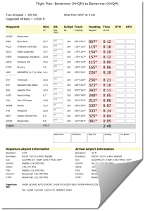
This is the planned routing – leaving at Bowerman Airport, then turn east and follow the Chehalis River upstream to the city of Elma.

A good VFR Orientation Point is the unfinished Satsop Nuclear Power Plant near Elma. It is there where the riverbed turns south and my plans foresee following it all the way to Centralia and the Interstate 5 which runs North-South here, coming from Vancouver and going all the way down to Los Angeles.

Following the Interstate 5 southbound will take me to the Columbia River which – followed upstream for a while – leads right into Portland.

Having passed Portland, the plan is to turn west, climb over the coastal mountains and hit the Pacific Ocean near Tillamook, Oregon. From there, it is all the way up the coast until I meet Westport with its small airport and the harbor. I will then finish the trip around Grays Harbor and the North Bay to make my landing back at Bowerman.
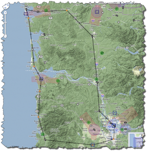
So much for the planned routing. The flight planning software comes up with a trip distance of 284.5 NM and an estimated 2:48h flying time.

Weather conditions have it that at Bowerman, Runway 24 is in operation and the sky conditions are clear with some clouds at 5.700 ft.

For this flight, I have decided – once more – on my Cessna 182 – kindly sold to me by Flight1 Software.

A Tour of ORBX Pacific Northwest

With my Cessna being fueled up and the outside check performed and all ready to go, I am having the last briefing with my co-pilot on the takeoff procedure and the routing.

[singlepic id=22 w=640 mode=watermark]

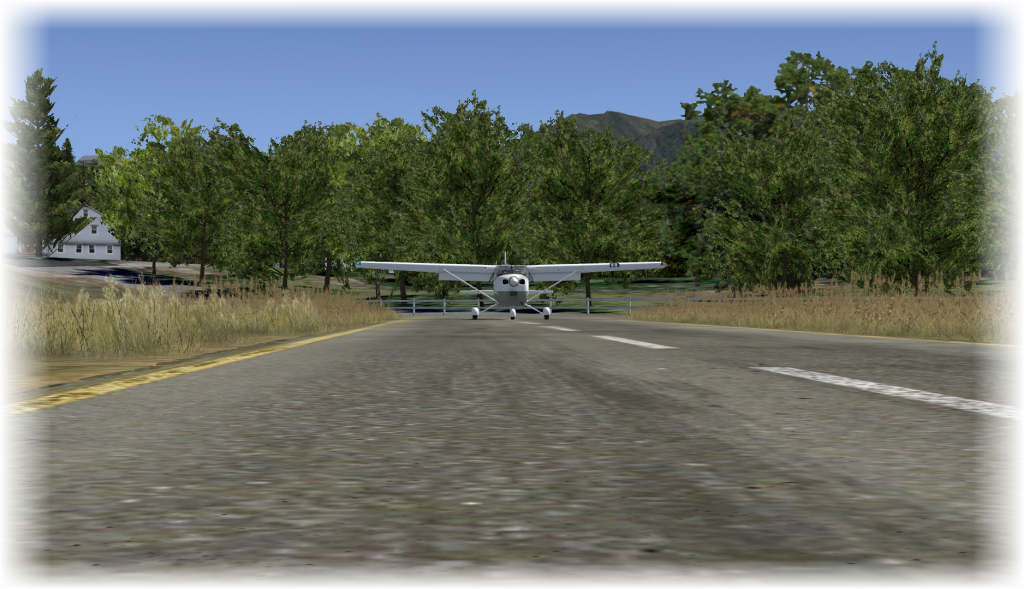
It is only a short taxi for us to Runway 24 but being parked right in front of the local FedEx building already allows a glimpse of the airport scenery – which, given it is actually freeware – is of quite a superb quality!

Once more, ORBX has been putting a lot of love and care into the design of the airport and although it is a small airport, the effort really pays off!

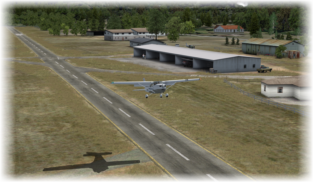
Lined up at Runway 24 and with no traffic in sight, we are airborne quickly and start climbing to our initial cruising altitude of just 2.500ft – good for sightseeing!

[singlepic id=23 w=640 mode=watermark]

Once you are up in the air and heading out to the bay, you can see the wonderful quality of the seabed texture – very nicely done, indeed – we will see more of that later when we return across Grays Harbor.

Having left westbound, I am flying a teardrop turn, returning over the airport and then heading east to follow the river. About 10 minutes later we have reached our turning point near the cooling towers of the nuclear plant near Elma. And hell, those cooling towers make an excellent VFR Landmark!

[singlepic id=24 w=640 mode=watermark]

Our new course is roughly 115°, still following the Chehalis River. After about 15 minutes, we reach the Interstate 5 which can be clearly seen from quite a distance – a long string of asphalt running south. Good for me – another excellent VFR Landmark.

We are passing Centralis and following the Interstate, already seeing the Columbia River in the distance. Another 20 minutes and we are passing KKLS – Kelso Longview Airport.

[singlepic id=25 w=640 mode=watermark]

The ORBX Portland Freeware Scenery

From here, it is just a short hop up the river and a few more minutes into the Portland Scenery. The approach to Portland is fantastic: at first, you are surrounded by the ORBX Pacific Northwest Scenery. Slowly, the Portland Scenery kicks in – we are passing detailed industrial areas and suburbs – with satellite images as ground texture and matching buildings placed on them.

When approaching Downtown Portland, the quality of this scenery starts to stick out – a very nice representation of a detailed, yet well-flyable downtown area – always around 20FPS on my system. You gotta see for yourself – but I did compile a couple of smaller screenshots.

[nggallery id=1]

Having passed Portland, I am turning west – towards the Pacific Ocean. The coastal mountains are forcing me to a higher flight level but 4.500 ft will get us easily across. And behind, I can already see Tillamook and the sea.

[singlepic id=26 w=640 mode=watermark]

When you reach the ocean near Tillamook, you will easily find a road following the coast and hugging the coastal hills. This is Oregon State Highway 101 – one of the most scenic routes I have found in the Northwest when I was there.

[nggallery id=2]

From there, it is all the way up the cost and I have to admit that the visuals the scenery creates are pretty well reflecting the roughness of the coast in real life – of course, nothing is like being there – but as a representation in Flight Simulator X, it is as good as one can expect it to be.

[singlepic id=27 w=640 mode=watermark]

We continue of the cost, cross the Columbia River again and finally reach Westport with its small airfield and the harbor. From here, you can also see Bowerman Airport to your right – today, with Runway 24 in operation – I will have to approach from the other side though.

[singlepic id=28 w=640 mode=watermark]

Our trip is coming to an end – a final loop over North Bay, then downwind to Aberdeen and into the final approach to the runway. Remember that I talked about the superb underwater textures of the bay? Well, here is a shot that might just show what I am talking about.

[singlepic id=29 w=640 mode=watermark]

Since we are not the only plane inbound to Bowerman, I need to fly the downwind leg a little bit longer, then turn heading 150° and finally 240° into the short final. Fully configured and with all checklists passed, we are ready to touch down.

[singlepic id=30 w=640 mode=watermark]

Bowerman Airport Freeware Scenery

Back at Bowerman, we leave the runway at the first possible exit and taxi back to the parking area. Like so many other ORBX Products, Bowerman is using 3D Gras objects as well as PeopleFlow technology to add to a more realalistic atmosphere.

[singlepic id=15 w=640 mode=watermark]

 The little airport is filled with life – this afternoon, the parking area is pretty crowded with planes – a Maule has just arrived before us, a Cessna Caravan is parked and a couple of Pipers are around as well. Well-placed cars, carefully crafted buildings and hangars and people animated with PeopleFlow add to the feeling of a nice little airport on a sunny afternoon.

What I really like is the great care the designers have applied to the airport: it is like building your very own Märklin train: the details like the gas tank at the back of the hangar add to the overall image – although you will never see them from the apron. But they just gotta be there because the scene would not be complete without them!

[nggallery id=3]

Conclusion

In general, the combination of all three sceneries was – from a performance aspect – acceptable on my system – I sometimes dropped as low as 9 FPS in busy areas but usually had 20+ FPS and often maxed out the 40 FPS which are the target rate for my system. And I do not have the latest hardware – an Intel Core2Extreme 9650 running at 3MHz with 8GB of RAM, an nVidia GTX560 Ti and Windows 7 64bit.

From a technology point of view, the ORBX Pacific Northwest Scenery is a landclass scenery covering an immense amount of square miles (or square kilometer, depending on where you are). It is so well-done that flying by VFR Landmarks is not a problem at all – rivers, river beds, mountain ranges – all where it belongs and with a superb mesh to support it. It will take more than just one flight to discover it and you will have plenty of opportunity for exploration flights.

It currently sells at 40.95 Australian Dollar (roughly 31 EUR or 42 USD) and I personally rate it as “worth every cent”. It is an outstanding example of scenery design and just makes me wait for the more southern sceneries to come.

The other two sceneries – KHWM Bowerman and Portland – are both freeware. Although at least Bowerman could have easily been sold as add-on airport. In other words: they cost you nothing but I would rate their actual value around 15€ for Bowerman and maybe 10€ for Portland – if you come to the city more often.

As with any scenery, you need to have some kind of personal string attached to it – if not, you may fly it once or twice to gasp at the technology but not as frequently as you would if you would feel “at home”.

For European FSX Pilots, the attachment to the area might be difficult (unless you have, like myself, spent some time in the US, either on business or vacation trips) but since Portland (and also, of course, Vancouver and Seattle) are regular destinations for all big European airlines, you get yourself a nice scenery coverage for those long-haul flights…

On all three packages: well worth having!


Posted in FSX | Tagged , , | Leave a comment

ORBX NA 1WA6 Fall City reviewed

It is not often in these days that you get a chance to look at something new when it comes to add-ons for Microsoft’s Flight Simulator X. Of course, an add-on can give you a new aircraft or an add-on can cover a scenery area in much greater detail than ever before – but new? No, that’s not new – that’s just exploiting the possibilities new hardware and experience present…

Looking at ORBX’s Airport Scenery for Fall City (1WA6), however,  suggested that finally something new might have come around. In this case, it was what ORBX is calling NatureFlow (next to it’s PeopleFlow which I also have not seen yet).

Purchase & Download

I have purchased the scenery right of the Flightsimstore Website at a price of 32.95 AUD. Not knowing the exact conversion rate yet, I am thinking this will turn out to be just around 25 EUR.

The download of the roughly 620MB and the emailing of the registration information was quick and easy – the download was finished in some very few minutes (less than 5).

Installation

The installation is quick and easy – the wrapper requires the usual data around your purchase, then the installation runs through smoothly.

The only important thing to note is that you must the latest patch for ORBX’s Pacific North West Scenery installed which you can download here.

Finally, from the same page, make sure to have the latest version of the ORBX Libraries on your system.

Location & Default View

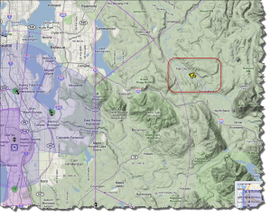
This little airport, Fall City (1WA6) is located some 26 miles east of Seattle. The terrain around the airport is scattered with hills, you can already see the Cascade Range to the East (and to the South).

The airport itself is located east of Fall City, in a bend of the  Snoqualmie River. It comes with a single runway bit interestingly seems to follow the concept of an Airpark with housing area to the south of the runway.

The default (or rather ORBX NA PNW default) does not really stand out by any means – just another airstrip in nowhere with some refueling and hangar facilities…

But that is going to change…

Configuration

If you want to be fair with the developers (and the product), its a good advice to read the manuals first (I know, most of us rarely do but if you don’t, you cannot complain about bad performance or odd behavior). So here are the changes to the settings based upon ORBX’s user manual:

  • Level of Detail Radius: Large
  • Mesh Complexity: 100
  • Mesh Resolution: 5m (which is marked as the required setting)
  • Texture Resolution: 15cm
  • Scenery Complexity: Extremely Dense
  • Autogen Density: Normal (based upon ORBX Recommendation)

A first Flight

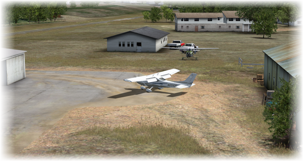
I have parked my Cessna 182 at the backside of the only hangar in Fall City. Something that needs to be done manually as the scenery does not offer any parking positions.

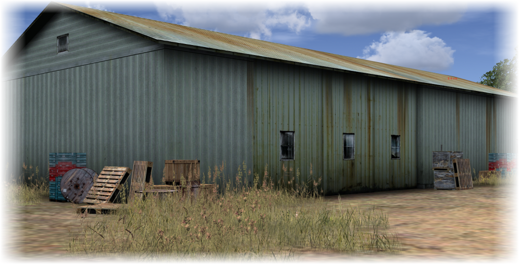
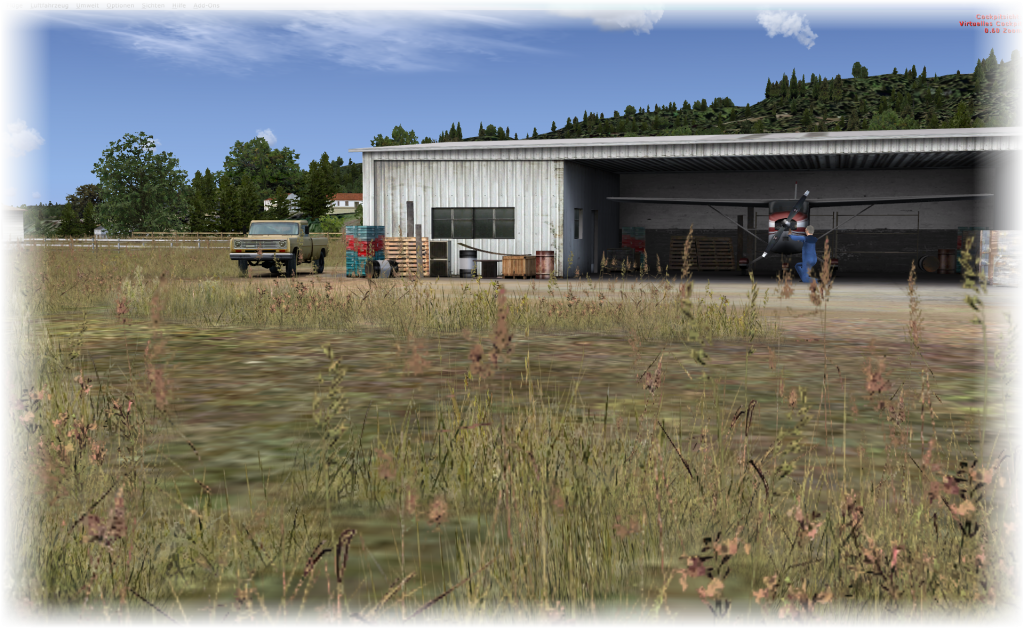
What catches the eye first is the intense care the designers have put into the design of the airport – at least in those areas that you would see under “normal” operations. All textures are crisp. The trees and the grass now moving in the wind add to the atmosphere of the airport – so do the obviously stacked crates and boxes on the hangar behind the aircraft.

But at the same time, it becomes obvious that that area around the hangar and adjoining buildings is about the only area of the airport that you usually would see – and then, the details which at first glance produce this “Wow, look at that…” effect will quickly become obviously confined to the area.

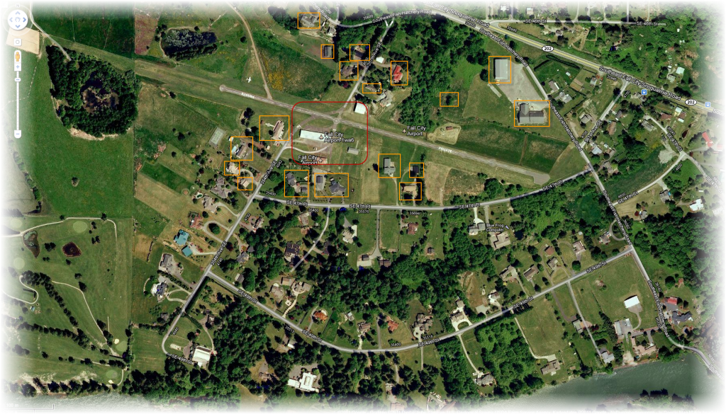
If you compare the scenery in Flight Simulator X with the aerial photo provided by Google Maps, you can quickly see which buildings are meticulously recreated and where default autogen objects (default as in “not following the actual building in form and shape”) have been placed.

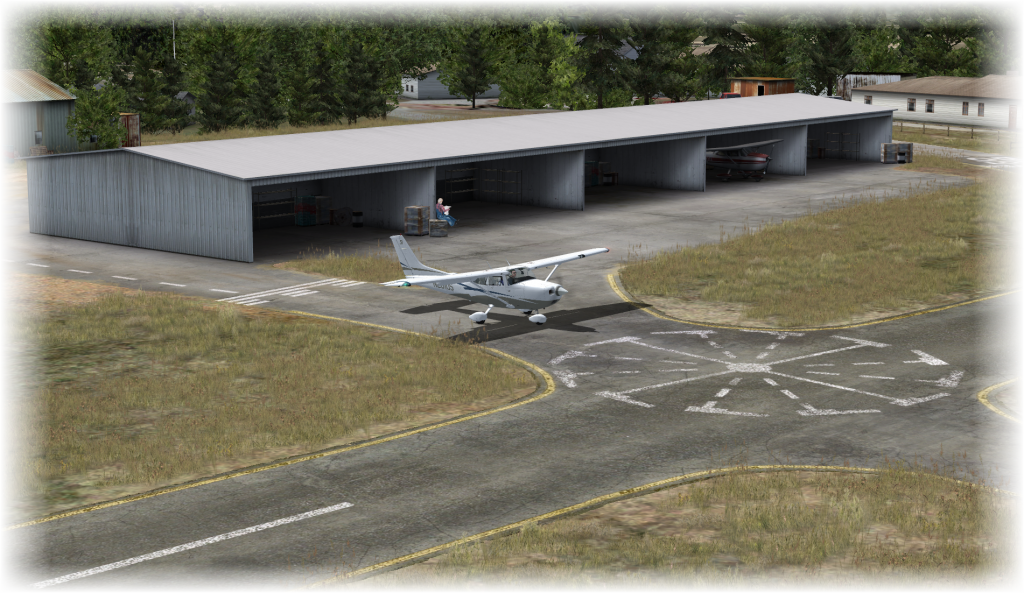
In the image above, the red square area is what I would consider the “central part” of this scenery – the hangar building, the two storage buildings south of the runway and the one north of it. These are solidly rebuild with extreme care and very well-defined textures. This is also the area where there placement of additional objects (cars, crates, etc.) as well as people (animated with PeopleFlow Technology) have been placed.

Outside this area – marked by the orange boxes – are buildings that have been custom-built to follow the original building in shape and form – but while their textures are carefully done, they are not loaded with the level of detail the hangars have been treated with.

Fall City in Real Life and ORBX Representation

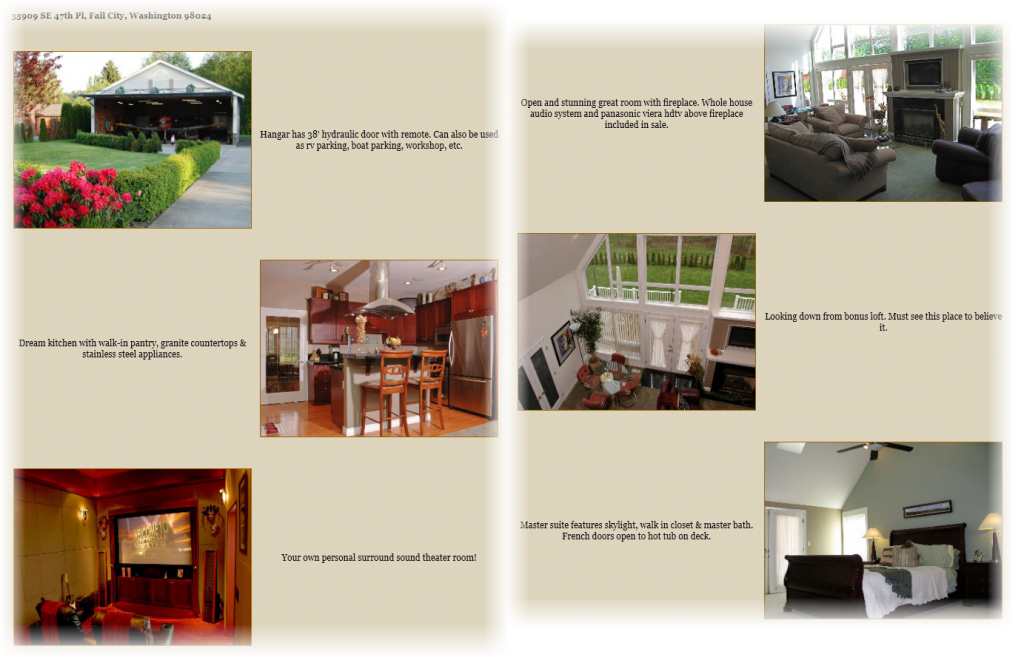
The biggest difference between the ORBX Representation and Real Life is not by any means the availability or lack of specific buildings. It is not even the animations with NatureFlow and PeopleFlow. In real life, Fall City is a privately owned landing strip attached to an Air Park. In FSX, the essence of this project – the ability to taxi from your very own house with your very own hangar to the runway and then take off into the skies… it is lost! If you want a taste, I have found one property being on sale as this post is written… check www.aviationacres.com for more examples.
While the airport itself with the hangars is very cleverly and nicely captured, the airpark area is not. Some of the neighboring houses are present but merely for the visuals – there are no taxiways to the homes you can use, there are no homes you can park your aircraft in front of – in short: there is nothing that would ultimately take this scenery above any other given airport (unless you live in Fall City and want to land “home”).

To me, that is a chance lost – that would be the story around the scenery that would have (or at least could have) separated it from the general airport sceneries we see every day. Without it, it just stays another airport, extremely well done but just another airport.

Seasons at Fall City

Because Fall City is not a photo scenery but a truly built FSX scenery, seasons are not only available but also make a difference in the scenery display.

The left image shows spring time in the hangar area – the grass is green and fresh, people are moving around, birds are chirping. The right picture represents the summer time: the grass has dried our a bit and taken more brownish look.

Left is Fall – the trees start to take a colorful look, the sun starts to draw longer shadows and finally, in Winter, everything is covered in snow.

Up where we belong…

Taking my Cessna 182 out of the hangar area (which requires some caution because the taxi way is pretty close to the hangar) and towards the runway, you will (at latest) notice that there are no taxiways at this small airstrip. You actually have to taxi on the runway so please make sure that you have the traffic monitored carefully at all times!

The runway is unmarked with the exception of the center line and the highly visible PRIVATE marking – guess, someone really wants to make sure that the people here stay amongst themselves…

With about 2000ft of runway (or roughly 600m) you are good to go with Cessna and similar aircraft – given the width, I would already feel a landing in a Baron or anything bigger a bit of a challange.

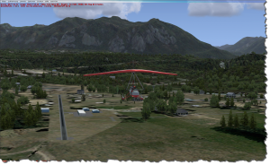
Finally airborne, you can enjoy the surrounding area which is only covered in the immediate vicinity of the airport.

The coverage here ends (to the west) at the city limits of Fall City – the city itself is not covered anymore!

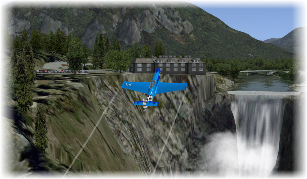
To the east, the covered area includes the Snoqualmie Falls area with the parking lot, building and bridge.

So all in all, once you have taken your aircraft to the skies, most of the surrounding area is provided by ORBX’s Pacific Northwest Scenery – and not necessarily the airport scenery.

Conclusions

Given that my system – an Intel Core2Extreme 9650 running at 3MHz with 8GB of RAM, an nVidia GTX560 Ti and Windows 7 64bit is not the latest and greatest in computer technology, I have to attest that the performance – always between 15-20 FPS and above – is more than adequate and provides for a perfectly flyable scenery.

Technically, the scenery is solidly designed and in those areas that have received special care (e.g. the hangars) far above average. Beyond that, I would say it is a scenery like any other professional scenery – nothing to complain about but also nothing that sticks out. I personally have to switch of collision checking, otherwise I end up with a crash in the middle of the runway but that might be my system.

With respect to PeopleFlow I have to say that this airport is too small to really see if PeopleFlow would add to the scenery. One mechanic looking at an aircraft, one guy walking around the Cessna and one more guy north of the runway standing by its car is simply not giving me the impression that I must have PeopleFlow… but maybe in an airport with a bit more life, that might be different.

NatureFlow is certainly something I do not need. Yes, it is nice to have the grass and the trees moving in the wind but honestly, how many times do you really pay attention to these details when you are busy taking your aircraft to the skies? The same stands for the birds chirping: in real life, you can of course hear then when walking around your aircraft, pulling it out of the hangar and maybe even while you are performing the first steps of the engine start checklist.

But as soon as the engine comes to life, that’s it – you will have your headset on by then anyway (which is eliminating most of the outside sound) and the rest is covered by the engine noise… no room for chirping birds.

If this would be around Sims in an Airpark, it would be different – but for a flight simulator?

Finally, I can only repeat myself by saying that the limits of the scenery – the runway and the hangar area as such – are way too small for me to justify the cost. It’s an eye-catcher, not more. But 25 Euro for an eye-catcher? I’d say on my personal list, it would be somewhere around 12.95 Euro but certainly not twice that much.

Nice little airport, solidly done with superb textures and love to detail in some places. But unless you have a specific attention to that airstrip… I cannot really recommend it… unless of course you need the eye-catcher 😉

Posted in FSX | Tagged , | Leave a comment

Image Archaeology

Today, I was scanning old documents and photos that my grandmother has been holding on for a life-time, as it looks like.

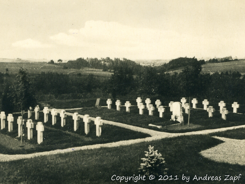
One of them caught my attention because it was clearly labeled to a location and seems to be something that once was officially sold as part of a set or so. Nothing more I got than the front and backside of this old black & white picture.

The image was one of an old military cemetery, the backside was holding some additional information:

I have nothing else but this picture so I was curious to see if and how the Internet can help to reveal the location and possibly the time the picture was taken.

When was it taken?

The image was certainly taken between 1918 and 1945 – the publisher Gräfe und Unzer is mentioned and Königsberg Pr. is named as the publisher’s home town. That would be Königsberg, Preussen which since 1945 is Kaliningrad.

Assuming that the publisher was up-to-date with legal affairs and assuming the image was not an older one that simply was recycled, the exact name pf the town given as Königsberg Pr. indicates that the image was taken between 1936 and 1945: before, it would have officially been Königsberg i. Pr. (vgl. Wikipedia on Königsberg).

Where was it taken?

That question seems to be more difficult to answer – the original label has been corrected (by whom is unknown) – it originally read “Gefallenfriedhof Mattischkehmen“, then had been corrected to read “Gefallenenfriedhof Kiauten“. I dare say it was a private correction – is seems like a blue pencil has been used to cross out the name Mattischkehmen and maybe a typewriter to place the name Kiauten.

Where are Mattischkehmen and Kiauten?

Looking up Mattischkehmen on the German Wikipedia site reveals a good hit: Mattischkehmen is today known as Sowchosnoje and lies about 120 Kilometers to the east of Kaliningrad.

But what about a War Cemetery? There are a couple of German websites about East Prussia that can help: and in fact, Mattischkehmen did have a war cemetery for the German and Russian soldiers who lost their lives in World War I.

But what about Kiauten? Again, the German Wikipedia can help: Kiauten is today named Smirnowo and lies about 16 Kilometers to the south of Mattischkehmen. However, the Internet does have no actual indication that there is (or has been) a war cemetery in Kiauten.

However, there is one war cemetery marked in Gawaiten which today carries the name Gawrilowo. Gawaiten only is about 5 Kilometers to the west of Kilauten and that seems to be close enough to try.

Image Comparison

Most extraordinarily, the Internet has photos of both war cemeteries, Mattischkehmen/Sowchosnoje and Gawaiten/Gawrilowo. Compare the two images and make up your own conclusions – maybe it is not so important where the picture has really been taken. Maybe it is more important that it took me on a journey through time and location and serves as a reminder that, despite all problems we may have today, other generations had less luck with their time than we have with ours…

Posted in Allgemein, Digital Photography | Leave a comment

Exploring RAW Image Development

One thing needs to be said first: I am neither a Photoshop /Lightroom Expert nor do I want to pretend to be one – so this post is more about my learning experience than a guide on how to develop RAW Images for the perfect result.

On the other hand, I thought it might be worth talking a little bit about experience exploring the topic because I do believe that everyone might be able to add at least a certain amount of development to their photos, even if one is not able to apply the perfect development – and in the end, it is about taste: your images are your images, so it is you who is deciding on how far you want to take them… so here is my example:

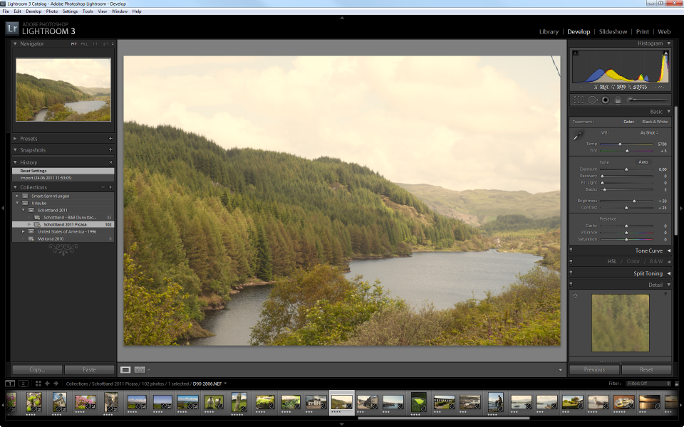
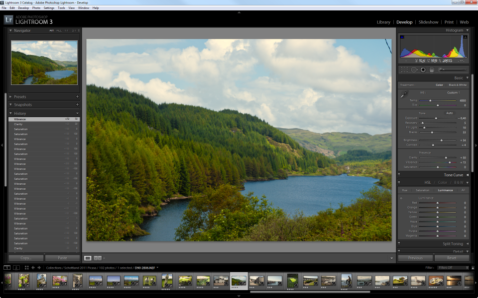
This photo has been taken in Scotland on a rather gray and overcast day – it was a quick shot from the roadside, even with a light drizzle of rain.

The Histogram

The Histogram is a graphical representation of distribution of data. It is a frequently used tool in the world of statistics, not in any way bound to the work done with digital images. With digital photography, the histogram is used to visualize the presence of brightness in the image.

The far left side of the image represents the dark side of the spectrum, the right side represents the bright side – if you are working with a black and white image, the left side represents Black, the right side represents White.

In a color image, at least in the RGB World, the Histogram shows the presence of information in any of the three color channels, Red, Green and Blue. Where information is present in more than one channel, the colors mix – e.g. if information is available on Green and Red Channels, the Lightroom Histogram shows Yellow. Where information is present in all three channels, the Histogram shows gray.

So far, so good – but what does it tell you? The Histogram of the image above shows two things: there is very little information on the left side and a rather big peak of data present on the bright side of things. The result is an image that lacks clarity – it is dull, contrast is low.

Adobe Lightroom 3 is doing quite a good job in helping you understand the Histogram and the impact of any change you are making to the image (as much as it reflects the Histogram).

As a first step, I am trying to adjust my image and make sure that the image is using the full available width of brightness – let’s focus on the bright tones first.

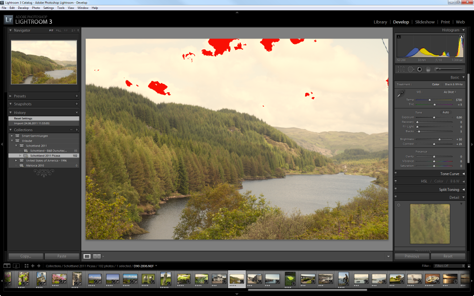
If you move the mouse cursor over the little arrow in the upper right corner of the Histogram, you can see the areas in the image that are cut off at the moment – Lightroom colors these areas in red – if you click the arrow, the display is persisted in the image window, if you click the arrow again, it switches back to the mouse-over mode.

As you can see in the above screenshot, there is quite a bit of information lost on the bright side of things – anything that is visualized red is displayed in pure white, regardless of the small distinctions in color that have been recorded by the camera’s sensor.

There are several ways to eliminate that loss of information and return the color in the now “lost” areas: I am going to use the Recovery slider to adjust this area of the Histogram – you could as well move the area in the Histogram directly.

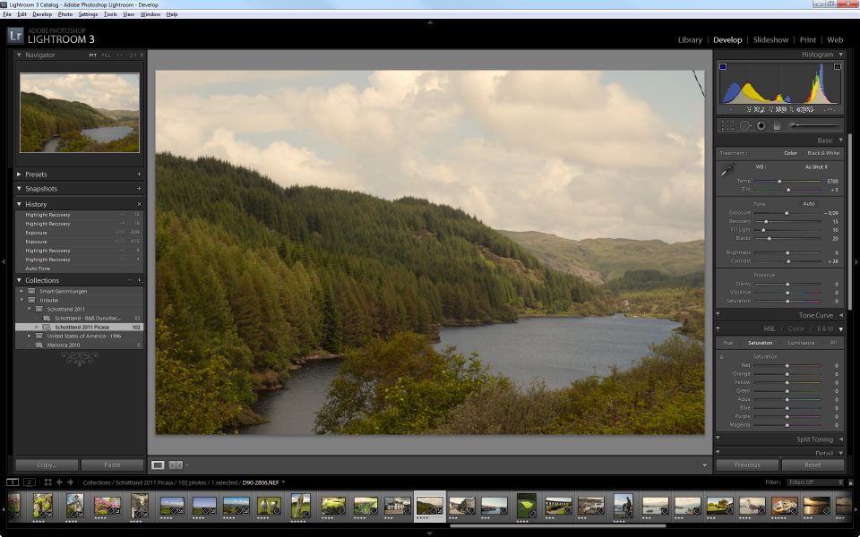
By moving the slider, I am little by little eliminating the clipping (visually indicated by the disappearance of the red clipping areas in the image). With Recovery at about 25, I have moved the spike from the edge of the Histogram ever so slightly towards the middle, with a tiny gap on the right edge – now all the information recorded by the sensor (on the bright tones) is within the image and nuances of white replace the formerly plain areas. That takes care of the white and light gray tones.

At the far right of the spectrum, the situation is quite the opposite: there is no information recorded for the dark areas – the result are washed out colors in the image. Now, we can take advantage of this situation and stretch the available information into the dark area until we reach a clipping (equals loss of data) which we are trying to avoid.

The small arrow in the upper left corner activates the display of clipping information for the dark channels – the color used to indicate loss of data here is blue. The more I move the slider for the Blacks, increasing its value, the more the data is shifted to the edge of the Histogram, resulting in the first blue pixels around a value of 25 which tells me to stop here because any further increase here would clip the dark tones.

The interesting thing with adjusting the Histogram is that all four sliders influence each other – it takes a little bit of playing to get a feeling for the Histogram – you can, of course, use Lightroom’s automatic adjustment by clicking the Auto button above the Exposure slider but all that does is trying to automatically figure out the best setting – with can but does not have to work.

Now, with very little effort, I have worked out significantly more details on the sky and the clouds than the original display of the image showed. The important thing to remember is that all this information has been recoded in the RAW Image and had just not been visualized – if I had set the camera to store the image as JPG, the information would have been lost.

Further improving the Image – White Balance

I am still not happy with the image – because of the weather that day, it still looks somewhat gray and darkish – and to me – slightly yellowish, although we now have spots of blue sky in it.

One of the important aspects of the RAW Image Development is finding the proper White Balance. To put it in simple words (you Pro’s, please excuse the over-simplification): the White Balance is what makes the White in your image appear white.

Unfortunately, the situation under which an image is taken (sunshine, clouds, flash or no flash, indoor, under-water, etc.) has a huge impact on the representation of colors. Unfortunately, your Monitor has as well!

So by setting the White Balance on an image, you are specifying under which light conditions the image was taken. Because Lightroom will try to compensate for the (specified) environment, the effect will be the opposite: specifying a very warm color condition (say 4500K), the image will shift to the cooler side of things to compensate. Specifying a very cold color (say 6000K) the colors will shift into the warmer section.

The image strip below shows the impact of White Balance on the sample image:  only by setting a different Color Temperature, the colors shift from cold to warm.

Again, I feel that White Balance is a matter of personal taste – I myself prefer the slightly cold tone on my images, others don’t.

While the Temp slider is adjusting the Color Temperature along an axis from Blue to Yellow, the Tint slider is shifting the colors along an axis from Green to Magenta. Best thing is to explore the impact of moving the sliders in either direction – as I said: to me, the best setting is a matter of taste.

If it is true that White Balance is a matter of personal taste, the next section is even more so.

Clarity, Vibrance, and Saturation

Let’s talk about Clarity first. The Clarity slider can take values from -100 to 100 – I will quickly show you the impact of the settings on the sample image, using both extremes and Zero.

You can use Clarity to add contrast to the medium tones in the image – that are the parts that fall into the mid of the Histogram.  And that explains why the impact on the sample image is sort of low: there are not too many areas falling into the mid-tones here. So Clarity has different effects on different images, depending on the distribution of tones within the image.

Next is Vibrance. Like Clarity, Vibrance can take any value between -100 and +100. To demonstrate the effect, I have compiled another sample strip, this time showing the effect from 0 to 100 with 50 as a mid-value keystone.

In this case I skipped the -100 extreme to demonstrate the positive range of values. Vibrance increases (or decreases if you go into the negatives) the intensity of dull colors while it leaves the saturated tones alone. And that is the big difference to the final slider, Saturation.

Saturation works on all colors in the image and intensifies them – the dull ones but also the ones that already have a high degree of saturation.

In other words: you can use Saturation to increase the brilliance of dull colors but it will (most likely) over-intensify the already saturated areas of the image, providing for overly gleaming colors.

From the results I have seen, it seems that Vibrance is the better choice to increase the brilliance of colors – but Saturation can be used to reduce the overall brilliance of a very intense image.

There are more possibilities – in fact, I just scratched the surface of image development. One thing, however, if quite obvious: many of these possibilities only expose their full power if you are working with RAW Files.

And then it is all about taste. As I said before: your images are your images. You need to like them and if you manipulate them, there is always a certain level of interpretation and art in them. You may find people saying that this is not the original image any longer and that is true – it is your interpretation of what the image should look like. Taking the shot no longer is the final step – it is only the first one.

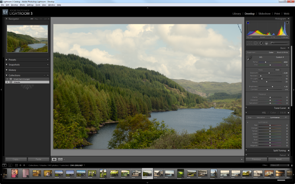
The image above shows the Before and After comparison built into Lightroom.it is quite a cool feature and quickly demonstrates the impact of the development process compared to the original image.

And the other cool thing: if you don’t like the result (or want to try different settings the next time): Lightroom does not in any way manipulate the original image so you can always come back. The changes (the development) are purely stored in Lightroom’s database and are applied when rendering the image (or exporting it).

But that, of course, also means that you need to take good care of your Lightroom database and regularly provide for backups! But that is a different (but very important!) story…

Posted in Digital Photography | Tagged , | Leave a comment

A proposed Workflow for Digital Images under Version Control

When playing with Adobe Lightroom 3 and Subversion, it quickly became obvious that the  committing changes to the Subversion Repository takes quite a bit of time for large files and/or large numbers of files. Also, any commit duplicates the versioned files (that is the essence of version control!) but you do not necessarily really need a new version any time, especially at the beginning when you are working with the files and get them into your photo repository.

Getting your Photos into Lightroom

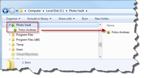
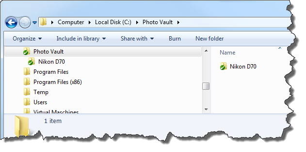
This is not supposed to be a Adobe Lightroom Tutorial, still I want to share some thoughts of how to fill your repository (the one under version control) with data using standard Adobe Lightroom 3 functionality. So the initial assumption is this: somewhere, there is a bunch of digital images sitting around on either some harddisk, memory card or CD/DVD and I want to get them into my Photo Vault (which is the name I have given my subversion repository). In order to do that, I have set up a Subversion Repository on the server and linked it to a local directory called Photo Vault.

The first category level in my Photo Vault is the image owner – there is obviously myself but there are images from other sources in my vault that I do not want to mix into my own photos.

So let me import the first set of photos which are currently located somewhere in a server-side harddisk.

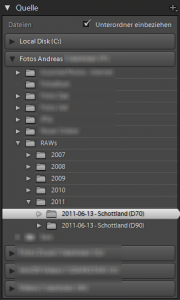
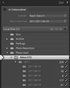
When I am selecting the source for the import operation, I can point to my server-side directory. Adobe Lightroom 3 will then analyze the photos within this directory (and its sub-directories if I want to) and propose the structure it is creating in the destination directory (depending on my settings).

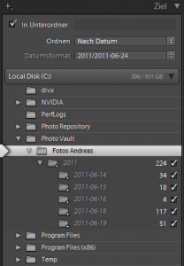
One of the neat features of Adobe Lightroom 3 is the ability to create that structure based upon the timestamps of the photos – so I can create something like <yyyy>\<yyyy-mm-dd> as directory structure.

While this is exactly what I need, there is one little problem with this: I am using multiple cameras and I do not want to mix the pictures of different cameras into a single directory as I would if I would just use the automated directory creation process.

The picture to the right shows the expected structure based upon the analysis of my selected set of photos.

So there are some ideas on how to get around this:

  • I could create a directory for each camera within the Fotos Andreas directory. That would then separate each camera’s photos from each other.
  • I could create a Collection Directory (e.g. Vacation 2011 – Nikon D90) in the Fotos Andreas\2011 directory and then put the pictures within it. That would allow me to keep the pictures in one directory based upon years and then split up in a manual process.
  • I could ignore the fact that I am using different cameras, rename the files in import to make sure they get unique file names and import them all into a date-based hierarchy as the system is currently proposing.

One thing that should not be forgotten is the following: we are talking about a storage of the raw data. The files will be located in these directories but they will most likely rarely be viewed from within these directories.

So instead of creating a storage structure that partially does what I can achieve later by building collections (or Albums, as Picasa would call them) I will focus on doing what I want to do: store my files.

If I do not want to mix distinctive physical properties of my photos (“Which camera was it taken with?”) with logical properties (“Who took it?” or “What was the story behind the picture?”) then I would have to revisit my idea of having the photographer as main category, wouldn’t I?

Which approach you would use in your own situation might be different – I have decided to use the most technical one, using the physical camera as main category. Primarily also because the approach with the Photographer will cause a different problem: what if (like in my case) one camera is used by more than one photographer?

It will also help to later apply camera-specific operations (especially when you treat a slide-scanner as a “camera”) to the set of photos.

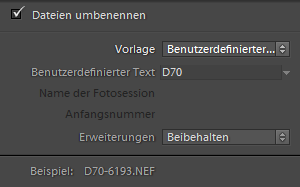
Nonetheless, there is another Adobe Lightroom 3 Feature I would like to use during import. I am not only owning a Nikon D70, I am also owning a Nikon D90. Both cameras are creating their files with a continuous counter (once you configured the camera accordingly!) but both are using the prefix DSC_ to name the pictures. This, unfortunately, does not seem to be configurable and the result is that both cameras might be using the same file name for different files. In order to avoid problems when later-on using such files in one compilation, I am telling Adobe Lightroom 3 to rename the files upon import, replacing the DSC_ with a D70_ or D90_ to make them distinct.

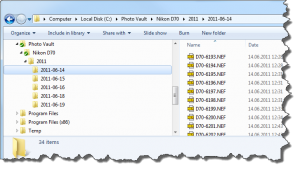
So when all these settings are done – and I am deliberately skip any other options I am having during import – my files are now located in my Photo Vault directory. As you can see by the missing green check-marks, they have not been put under version control yet – they simply have been copied into the repository directory!

Why is this important? Well, because of two things:

You still have to manually add them to Subversion and commit them – otherwise, they are nothing but local files and that somewhat defeats the purpose of the version control exercise!

And secondly: this is your change to make additional changes to these files without having to create a new version (and thus duplicating the storage space needed for them!).

Making additional changes before applying Version Control

If the idea of version control is to track any changes to files then why would you do something before applying version control? Well, the answer is simple: to save space on the repository.

The whole idea of having version control is to prevent unexpected, involuntary changes to the data and not detecting it if it still happens.

In my current situation, I am working with the data and if anything should go wrong, I can still re-import from the media I have used used (I copied the files, I did not move them on purpose!) – so if anything goes wrong now, I will most likely detect it and I can still correct it.

So what would be an additional change that I would like to make at this point in time? One has already taken place: the files have been renamed to their new naming scheme but if I had not done that upon import, now that would be one change to make before committing the files to Subversion.

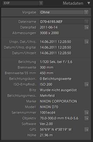
Another one is meta-data enrichment: I have imported photos for which I am having a GPS Track recorded. My camera does not have a built-in (or add-on) GPS so if I want to geotag the photos, I would have to do it now. Since the topic of this post is not about geo-tagging, I have described this process some other place but trust me: it is quite cool!

I cannot see my changes in Adobe Lightroom…

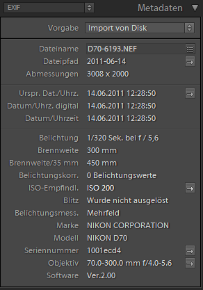
With the process described above, I have added geotags to my photos. Now if I go back to Adobe Lightroom 3 and examine the EXIF Information of the images, I cannot see the geotags in there.

The reason is quite simple: the EXIF Information has been read from the picture upon the time of import – and that was before I added the geotags to the files in the repository.

Two things become obvious: Adobe Lightroom 3 needs to refresh the EXIF Information now – and the files have really changed since the geotags have been added to them.

In Adobe Lightroom 3, select the images for which you want to re-read the EXIF Information. Then choose Metadata -> Read Metadata from File from the menu.

Adobe Lightroom 3 will now process the selected files and once finished, you will be able to see the meta-data information including the geotags in the EXIF Information window.

From there, you can even click the little arrow next to the GPS Information to open a browser indicating the position in Google Maps.

So this has now been taken care of. Back to the original topic of digital photos and version control!

We are now having the images imported into our file system directory which is linked to the Subversion Repository. We have included these files in Adobe Lightroom 3 so the information about them it in Lightroom’s database. We have enriched these files with additional information – in our case the GPS Information. By all means, these files are physically ready to go under version control – there is nothing more to do to them right now.

Putting the Images under Version Control

In order to work with Subversion from my desktop PC, I have installed Tortoise SVN as a client application. That gives me the nice overlays in my Windows Explorer as well as the most frequently used commands at context menu level.

So in Windows Explorer, select the root of the directory branch you want to put under version control, then choose Tortoise SVN -> Add from the context menu.

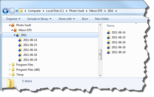
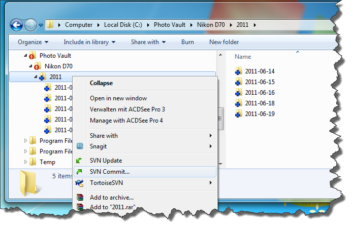
You will have to go through a couple of windows telling you exactly which files will be added and where you are in the current progress with respect to all files you are adding. Once done, your files and directories will be marked with a blue plus sign – that is the indicator that upon the next commit operation, these files will actually be copied into the subversion directory and are under version control from then on.

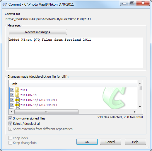
When you are ready to commit the files, select SVN Commit from the context menu.

You will be asked to enter a commit message – you do not have to but it is recommendable to do so if you later-on want to understand why a specific change has been made.

Once you click the OK button, the process of committing will take place. And it can take some time because all these files are now transferred to the Subversion Server and that will take a little while. In my case, we are talking 460 files of 1.16GB altogether – the commit took about 10 Minutes.

A Word of Warning

With the images now under version control, there is one thing that you should not do any longer: do not delete, move or rename the files using Windows Explorer! Subversion will not be able to track the files if you start moving them around – if you have to, there are Subversion methods (integrated into the Windows Explorer) to do so but do not use the standard Windows functionality or equivalent functionality of other programs! Especially, do not use Adobe Lightroom 3 to batch-rename the files once they have been placed under version control!

Posted in Digital Photography | Tagged , | Leave a comment